 |
 |
|
| |||||||||||||||||||||||||||||||||||||||||||||
|
March 28, 2005
Team Charts
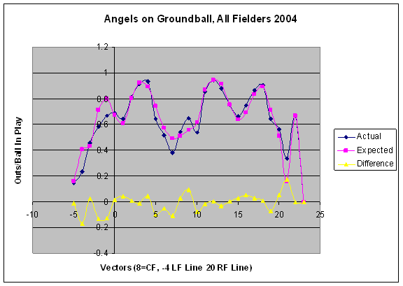
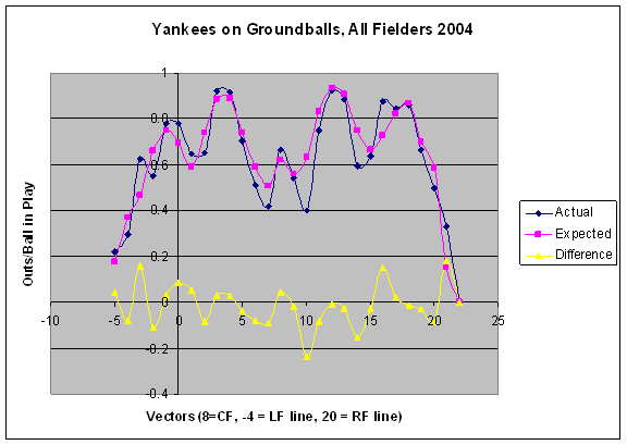
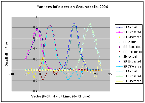
With the introduction of a graphical representation of the Probabilistic Model of Range for players, I've had a couple of requests for entire infields, specifically the Angels and the Yankees. I'm presenting the charts for groundballs in two ways:
Note that I don't break it out by individual players; it's all shortstops for a team or all third basemen for a team. Without further ado, here are the charts for the Angels and Yankees. (Click on graph for a clearer view.)
One example of how to use these charts is to look at the hole between third and short for the Angels, vector 1. The Angels as a whole are above average here, but it's due to the third basemen being way above average, while the shortstops as a whole are below average. The other thing these graphs are telling me is that I don't have park effects right. The expected curves for the two teams mostly look as they should; They have four humps representing the straight-away position of the fielders, the places where you would expect the most outs. But the Angels have a big hump down the right field line; the Yankees have a smaller hump up the middle. There's no reason for me to believe that a ground ball down the line is easier to field in Anaheim than anywhere else in the majors. Even though the data is smoothed (1/2 without park effects, 1/2 with) it's obviously not enough. I'll be persuing other ways of dealing with park effects in the near future. Baseball Musings is holding a pledge drive during March. Click here for details. Comments
Suggestions on presentation 1) ditch the grey background - it's chart junk. If you need the contrast, use light grey 2) Solid lines 3) As before, numbers bottom and left, rather than at the axis 4) when breaking the curves out by position, use the same colors for each data series. Trust the picture to tell the story. 5) Field landmarks, rather than vectors, as labels 6) Kill the dots that mark the datapoints, they aren't adding anything. I'm hoping you'll publish these for the rest of MLB as well. Posted by: Danil at March 28, 2005 03:53 PMInteresting to see that for the Yankees, the SS weakness is a 3B strength. ARod gets all the balls to his left, which kinda makes sense since it's easier for him to make that play. Plus ARod is a better fielder than Jeter. Posted by: sabernar at March 28, 2005 04:18 PMDavid-- forgive me if this is a stupid suggestion. I'm not clear on what data/method you used to figure park effects; but if you used actual events rather than theoretical models, is it possible that _everybody_ positions their fielders to guard the line more often in Anaheim than elsewhere, not making the ground ball there "easier to field," but rather "more often fielded"... and producing your "hump?" That is, while the "score" of the defenses at the humps is low, the contour of the "actual" line tends toward conformity-- would that happen if the prediction were a glitch? Wouldn't it just be an "empty" peak if this were pure system error? Posted by: john swinney at March 29, 2005 02:36 AMJohn, I do use actual events rather than a theoretical model. It's possible that every one in Anaheim guards the line, but it's also possible that the Angels guard the line everywhere much more than other teams. It may not be a park effect, but a team effect. Posted by: David Pinto at March 29, 2005 07:46 AMThen David-- stretching out to where the theoretical gets even thinner-- is it possible that the Yankees cheat their middle infielders toward second in double play situations, and so run them right into balls hit back throught the middle, creating "extra" outs in a lump there? Or perhaps the Yankee staff fields grounders through the box poorly leaving more chances for Jeter and Cairo or whoever? Or a combination of the two? The impressive thing to me about your charts is their isomorphism to real players and real actions and reactions. I'm sure there will be tweaks needed, but you are breaking new ground here--it may be easy to mistake information for noise for a while. I'd be very surprised if your stuff doesn't show us all sorts of things we haven't been spotting up to now. Perhaps not here-- but we may be blind men describing an elephant for a while... it might be good to walk around it a few times before deciding which end to feed and which to shovel... Post a comment
|
Navigation
EMail
Home About the Author Dedication Baseball Musings Radio Show Sporting News Columns Day by Day Database Lineup Analysis Defensive Charts, Probabilistic Model of Range Syndicate this site:  Full post feed: Robot Podcast Feed Terms of Service Mitchell & Ness Throwback Jerseys View blog authority
Tickets and Other Links
Buy MLB Baseball tickets online including Boston Red Sox tickets, New York Yankees tickets, Baltimore Orioles tickets, Chicago Cubs tickets, San Francisco Giants tickets, Washington Nationals tickets, Los Angles Dodgers tickets, Florida Marlins tickets. San Diego Padres tickets, Cardinals box seats and premium astros tickets. We also carry concert tickets and theater tickets.
MLB Baseball Baltimore Orioles Tickets Boston Red Sox Tickets Chicago Cubs Tickets Chicago White Sox Tickets Houston Astros Tickets LA Dodgers Tickets New York Yankees Tickets Washington Nationals Tickets and St Louis Cardinals Tickets GET ME IN! is the leading marketplace for: Sports Tickets Football Tickets Rugby Union Tickets Rugby League Tickets Hong Kong Sevens Tickets MotoGP Tickets Grand Prix Tickets NBA Tickets NFL Tickets Theatre Tickets and Concert Tickets Ticketamerica.com MLB Tickets Chicago Cubs Cincinnati Reds Houston Astros Milwaukee Brewers Pittsburgh Pirates St. Louis Cardinals Boston Red Sox New York Yankees Tampa Bay Devil Rays Premiership football tickets FA cup tickets Champions league tickets Football tickets Olympics tickets Super Media Blog
Calendar
Recent Entries
New RSS Feed
New Look Coming Team Offense, Arizona Diamondbacks Lastings Impression Pledge Drive Update Long Term Lester Stadium Pictures Lugo and Lowrie Pledge Drive Update Team Offense, Pittsburgh Pirates
Search
Archives
By Category:
Advertising (10) Agents (12) All-Star Game (173) All-Time Greats (239) Army Strong (8) Attendance (174) Authors (3) Awards (169) Base Running (78) Baseball (1581) Baseball Jerks (219) Blogs (759) Books (129) Broadcasts (568) Charity (49) Cheating (665) Collectibles (15) College (1) Colleges (3) Commissioner (40) Conditioning (1) Contests (10) Crime (100) Cuba (1) Deaths (169) Defense (372) Demographics (8) Discipline (12) Division Races (724) Draft (63) Equipment (25) Fan Rant (46) Fan Violence (10) Fans (58) Fantasy Baseball (38) Feats (3) Films (3) Free Agents (782) Games (5549) History (102) Hit Streaks (22) Humor (64) Ice Cream (4) Illnesses (135) Independent Leagues (16) Infrastructure (3) Injuries (1122) International (76) Interviews (168) League Championship Series (1170) League Division Series (923) Little League (2) Management (1281) Mascots (4) Matchups (698) Mechandising (46) Minor Leagues (12) Movies (9) News Media (96) Oddities (1) Offense (216) Old Timers (4) On Base (18) Opening Day (210) Opening Day Impressions (19) Other (321) Owners (73) Pennant Races (32) Pitchers (2911) Players (1524) Podcasts (185) Post Season (59) Power Hitting (5) Pranks (1) Predictions (145) Probabilistic Model of Range (108) Public Relations (8) Records (153) Rivals (2) Rookies (44) Rules (25) Salaries (12) Scheduling (22) Science (1) Scoring (5) Series (61) Simulations (5) Sluggers (752) Spring Training (117) Stadiums (279) Standings (25) Statistics (996) steroids (1) Strategy (171) Streaks (14) Superstitions (16) Team Evaluation (937) Team Movements (58) Tickets (56) Trades (700) Transactions (321) Umpires (53) Uniforms (17) Union (22) Welcome! (3) women (4) World Cup (170) World Series (657) By Month: March 2009 February 2009 January 2009 December 2008 November 2008 October 2008 September 2008 August 2008 July 2008 June 2008 May 2008 April 2008 March 2008 February 2008 January 2008 December 2007 November 2007 October 2007 September 2007 August 2007 July 2007 June 2007 May 2007 April 2007 March 2007 February 2007 January 2007 December 2006 November 2006 October 2006 September 2006 August 2006 July 2006 June 2006 May 2006 April 2006 March 2006 February 2006 January 2006 December 2005 November 2005 October 2005 September 2005 August 2005 July 2005 June 2005 May 2005 April 2005 March 2005 February 2005 January 2005 December 2004 November 2004 October 2004 September 2004 August 2004 July 2004 June 2004 May 2004 April 2004 March 2004 February 2004 January 2004 December 2003 November 2003 October 2003 September 2003 August 2003 July 2003 June 2003 May 2003 April 2003 March 2003 February 2003 January 2003 December 2002 November 2002 October 2002 September 2002 August 2002 July 2002 June 2002 May 2002 April 2002 March 2002
Credits


|
||||||||||||||||||||||||||||||||||||||||||||